This is part six of our custom block development series, in this article we are going to learn how we can top toolbar buttons and sidebar controls for our custom block. This article is a continuation of our previous articles so if you haven’t read them yet make sure to check them out. You can go to this link for the previous article or on this link to get a complete list of all articles of this series.
Till now we have learned how we can create our own custom block with styling and editing and how to add multiples in one plugin now let’s take a look at how we can provide users toolbar to customize the blocks and add a sidebar for our custom block, so first let’s start with adding alignment option in the toolbar.
Table of Contents
Toolbar for Custom Block

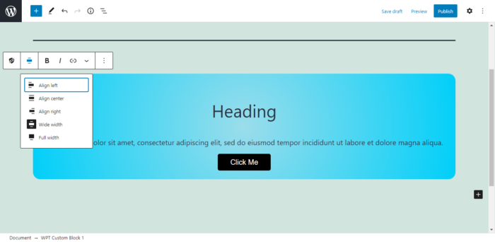
The control options provided for blocks on top of the custom block as shown in the image is a toolbar and it has some buttons that can perform certain actions for our custom block. By default, every block has its icon button (for block transform functionality) and block more options toolbar (for removing, duplicating, and other common stuff).
As for customizing the toolbar we still don’t have control to remove something but we can add some more options between those too like WordPress components toolbars provided by WordPress itself or completely custom of our own if we want.
The other buttons in the toolbar get added after adding certain components like the RichText component. The component will automatically add some of its controls in the toolbar. For now, our toolbar has its default options and RichText components options.
Add a block alignment toolbar
Now let’s see how we can add a block alignment toolbar for our custom block. The block alignment toolbar in general is available for all the blocks so it will make sense to have it in our custom block too. There’s a component called BlockAlignmentToolbarthat we can use to add an alignment toolbar for our block but I do not recommend it. Using it means we need to manually handle classes for the block alignment and we need to handle and make sure that blocks are taking full width and wide with when the user chooses these options from the toolbar. Thankfully WordPress has made this process very easy and fully automatic.
Note: Align wide and full functionality is only available in themes that have added support for it. If you manually want to add it you can add support for these by adding add_theme_support('align-wide')in after_setup_themehook.
To add alignment toolbar automatically we need to add a property inside our registerBlockType()function called supports. Now to add the alignment toolbar we need to set alignto trueas shown in the code below.
supports: {
    align: true
},
 After adding this property you’ll see all the block alignment options in the block toolbar as shown in the image above.
Alternatively, for better control over the alignment options instead of passing true, you can pass an array to the align property. In that array, we can type all or some of these left, right, center, wide, and full. The names you added will be the option available for the block.
supports: {
    align: ['left', 'right', 'center']
},

When you add the above property for your custom block, you’ll only get the option to align your block in ‘left’, ‘right’, or ‘center’, no full and wide option. As you can see in the image above.
Set default block alignment
Having these alignment options are fine, but what if you want to have a default alignment for your block? well, here’s how you can do that. You can achieve that by making an attribute. The attribute key will be ‘align’ and set the type to string and set the default to any possible value of alignment.
attributes: {
    align: {
        type: 'string',
        default: 'wide'
    }
},
supports: {
    align: true
},
After adding the above code default alignment will be set for your custom block and you can switch to a different alignment if you want as shown in the image above.
Set text alignment
Now let’s see how we can set a text alignment for our block, unfortunately, we don’t get an automatic option to set alignment for our block so we have to add it manually but we do have a WordPress component that can help us perform this task easily.
In order to not confuse our users, I am removing ‘left’, ‘right’, and ‘center’ alignment options from the block alignment toolbar and just keeping the ‘wide’ and ‘full’ properties. Also, I have added text-alignment property for our block background in CSS, I am removing that as well because it will conflict with the toolbar alignment and it won’t work.
To add text alignment for our block we will use BlockControlsand AlignmentToolbar components both of which are from the wp.blockEditorpackage. To make it work we have to add AlignmentToolbarinside our editfunction and in savewe need to get the alignment from the AlignmentToolbar. So let’s look at the code first and I will explain it below the code.
const { registerBlockType} = wp.blocks;
const { RichText, BlockControls, AlignmentToolbar } = wp.blockEditor; //Added BlockControls and AlignmentToolbar


// Registering A Block
registerBlockType('wpt/wpt-block-1', {
    title: 'WPT Custom Block 1',
    category: 'custom-category',
    icon: 'superhero',
    description: 'First Hello World Block',
    keyword: ['test', 'searchme'],
    attributes: {
        textHeading: {
            type: 'string',
            default: 'Heading'
        },
        textPara:{
            type: 'string',
            default: 'Lorem ipsum dolor sit amet, consectetur adipiscing elit, sed do eiusmod tempor incididunt ut labore et dolore magna aliqua.'
        },
        textButton: {
            type: 'string',
            default: 'Click Me'
        },
        textAlignment: {  //Alignment attribute to access the alignment in save function
            type: 'string',
        },
    },
    supports: {
        align: ['wide', 'full']
    },

    // Block Edit Function
    edit: props => {

        const alignmentClass = (props.attributes.textAlignment != null) ? 'has-text-align-' + props.attributes.textAlignment : '';  //getting value from textAlignment attribute and checking if textAlignment property has null value then set it to empty

        return(
            <div className={alignmentClass + ' wpt-back'}>
                <BlockControls>
                   <AlignmentToolbar
                       value={props.attributes.textAlignment}
                       onChange={(newalign) => props.setAttributes({ textAlignment: newalign })}
                   />
                </BlockControls>
                <h2 className="wpt-heading">
                    <RichText
                    value={props.attributes.textHeading}
                    onChange={content =>  {
                                props.setAttributes( { textHeading: content } );
                            }}
                    />
                </h2>
                <p className="wpt-para">
                    <RichText
                    value={props.attributes.textPara}
                    onChange={content =>  {
                                props.setAttributes( { textPara: content } );
                            }}
                    />
                </p>
                <RichText
                className="wpt-button"
                tagName="a"
                value={props.attributes.textButton}
                onChange={content =>  {
                            props.setAttributes( { textButton: content } );
                        }}
                />
            </div>
        )
    },

    //Block Save Function
    save: props => {

    const alignmentClass = (props.attributes.textAlignment != null) ? 'has-text-align-' + props.attributes.textAlignment : ''; //getting value from textAlignment attribute and checking if textAlignment property has null value then set it to empty

        return(
            <div className={alignmentClass + ' wpt-back'}>
                <h2 className="wpt-heading">
                    <RichText.Content value={props.attributes.textHeading} />
                </h2>
                <p className="wpt-para">
                    <RichText.Content value={props.attributes.textPara} />
                </p>
                <RichText.Content className="wpt-button" tagName="a" value={props.attributes.textButton} />
            </div>
        )
    },
});
First, at the top, we are getting BlockControlsand AlignmentToolbarfrom wp.blockEditorpackage.
Then we have created an attribute in attributes by the name textAlignmentand set its type to string.
After that inside our editfunction, we have created a alignmentClassvariable and in that variable, we are getting value from the textAlignmentattribute. We are also adding validation so if the attribute is null then it will set the attribute value to an empty string.
Now in our background <div> </div>we have added the created variable as a class and concatenated the class we have declared explicitly.
After that inside our <div> </div> we have added <BlockControls> </BlockControls>component, then inside that, we have added <AlignmentToolbar> </AlignmentToolbar>component. The value of AlignmentToolbaris the textAlignmentattribute we have declared above.
After that, we have called the onChangefunction to save the new alignment inside our textAlignmentattribute.
Now next is our savefunction, in this function first we have created the same alignment variable as editfunction. And put that variable as background <div>class.

And with that now our custom block text has the ability to be aligned ‘left’, ‘right’ or ‘center’ as shown in the above image.
Custom Toolbar
Now let’s see how we can add our custom button in the toolbar and perform certain actions based on button click. You can perform any action whatever you want, add some CSS class in the block, add more components into a block, or whatever you can do anything.
Now to add a button in the toolbar we need to use Toolbarand Buttoncomponent from the wp.componentspackage. Both of these components will be added inside <BlockControls> </BlockControls>component.
To use this component first we need to add wp.componentsas a dependency in our plugin.php file where we are registering the block script.
// Add block script.
wp_register_script(
    'wpt-block',
    plugins_url( 'build/index.js', __FILE__ ),
    ['wp-blocks', 'wp-editor', 'wp-components'] //dependencies
);
Next, we declare the as variable on top of our block script file.
const {Toolbar, Button} = wp.components;
Then at last we will use it inside our <BlockControls> </BlockControls>component of editfunction.
<BlockControls>
    <AlignmentToolbar
        value={props.attributes.textAlignment}
        onChange={(newalign) => props.setAttributes({ textAlignment: newalign })}
    />
    <Toolbar>
        <Button
            label="custom button"
            icon="edit"
            className="my-custom-button"
            onClick={() => console.log('pressed button')}
        />
    </Toolbar>
</BlockControls>
Inside our Buttoncomponent we can set label, icon(dashicon), className and onClick function.

After that our custom toolbar button is added for our custom block and when you press it, it will log ‘pressed button’ in our browser console. As you can see in the image above.
Inspector/Sidebar for Custom Block
Along with Toolbar we also have a Sidebar for our custom blocks to add more customization options for the block. In the toolbar, we can only add buttons that perform certain actions or to be more precise call a function but with the sidebar, we can accept input, add radion button, color picker, dropdown list, checkbox, and much more.

As you can see in the picture that is how a default sidebar with no extra options looks, you access it via clicking on the gear icon of the block editor. By default for every block, the sidebar has its name, icon description, and in Advance option additional CSS Classes option.
Now let’s see how we can add sidebar controls for our block.
Adding Sidebar
Before adding a sidebar one thing to note is that the content of the sidebar is organized into different sections (referred to as a panel in code) for better design and collapse and expand functionality. That’s why it is recommended to properly organize options inside our sections in different panels.
The panels are added inside the InspectorControlscomponent, to add anything in the sidebar you need to add it inside the InspectorControlscomponent. It exists inside the wp.blockEditorpackage.
To add a panel (for adding expand and collapse functionality) we will use a component called PanelBodywhich exists inside the wp.componentspackage. The PanelBodycomponent accepts few parameters, we can add its title, expanded or collapsed status, an icon, or even attach a function when expand-collapse trigger.
While using PanelBodyWordPress recommends using PanelRowcomponent for properly aligning the components inside PanelBody. The PanelRowcomponent automatically add some margin and flex row styling for the components, so it is always a good idea to add every component in separate PanelRowcomponent.
Now let’s add a checkbox inside the sidebar for our custom block.
To add a checkbox inside our sidebar we need to import this component and save it inside our variable for the checkbox component called CheckboxControlavailable inside the wp.componentspackage. since we are going to use PanelBodyand PanelRowcomponent we will import them as well. Also, the InspectorControlscomponent so we can add components inside our sidebar.
The InspectorControlscomponent will be imported from the wp.blockEditorpackage andCheckboxControl, PanelBodyand PanelRowcomponent will be exported from wp.componentsas shown in the code below.
const { InspectorControls } = wp.blockEditor;
const { PanelBody, PanelRow, CheckboxControl } = wp.components;
Now to use that first we will add <InspectorControls> </InspectorControls>inside our editfunctions’ return statement and inside that <PanelBody> </PanelBody>for the PanelBodywe can add the title as a normal string and add initialOpen={true}to make it expanded by default.
Now inside PanelBodywe will add <PanelRow> </PanelRow>and in that, we will add our <CheckboxControl/> component. For the CheckboxControlwe can add a label, checked status, and trigger an onchange function. By now you are pretty familiar with using attributes to store the value and use it in the edit so I won’t gonna do that and simply log the value on the console.
<InspectorControls>
    <PanelBody
        title = "Block Setting"
        initialOpen = {true}
    >
        <PanelRow>
            <CheckboxControl
                label = "Checkbox"
                checked = "true"
                onChange = {() => console.log('check changed')}
            />
        </PanelRow>
    </PanelBody>
</InspectorControls>

wp.components Github repo.When to Use Toolbar and Sidebar?
Another important thing that you should know is when to use Toolbar and when to use the sidebar for giving options to our blocks. It is important to know because technically you can use Toolbar components inside your sidebar and in some cases that will be fine but not always so let’s know a bit about whom to use when.
So inside your toolbar, you can add controls for your block but in the toolbar, you should only use the controls that can be used as a button such as trigger certain events or use the predefined options provided by WordPress like the block alignment controls. On the other hand, you should use a sidebar when some settings are either used less often or require more screen space such as color picker.
Also, in the sidebar, you should only add block-level controls that affect the whole block not any component inside a block because the sidebar is for the block and no matter what component you have selected inside the block, the scope of the sidebar will always be the block.
Conclusion
Now you know how we can add a toolbar button for our custom blocks so we can give the option to users to customize blocks in a way they want. We have learned how we can add a toolbar with the WordPress automatic option also with the WordPress component and even create our own if we want.
We have also learned how we can sidebar controls for our blocks so we can give users more flexibility over how they wanna style their block. Another important thing is to know what controls to add in the sidebar and what in the toolbar and we have learned that as well.
You can get the complete source code used in this article and in the complete series on my Github repo.
If you are facing any issues or have any doubt, questions, or suggestions regarding this article make sure to comment down below, we will try to reply as soon as possible.